Time to talk about graphic finishes...

PFDarkside

of the Forum
Click image for larger version  Name:	1E9F52C1-FACB-4E93-9AEC-267FE354C19E.jpeg Views:	21 Size:	105.1 KB ID:	6054841 Click image for larger version  Name:	3158374E-C86C-4F11-8D16-4A400ED6E68F.jpeg Views:	21 Size:	109.6 KB ID:	6054842 Click image for larger version  Name:	B229ACFB-0E61-4EC8-812C-0EAFAF568F05.jpeg Views:	21 Size:	131.0 KB ID:	6054843

Click image for larger version  Name:	1E9F52C1-FACB-4E93-9AEC-267FE354C19E.jpeg Views:	21 Size:	105.1 KB ID:	6054841
his is a trend that has mostly faded away, so what’s a better time than now to discuss?

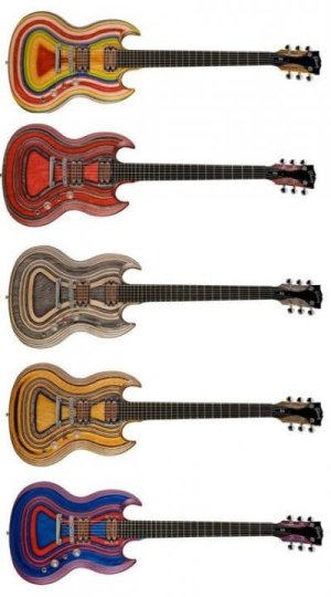
Graphic, and especially airbrushed finishes.

A quick search on the Jackson Facebook group returned most of these, but the Clapton’s, Hammetts, and EVHs are all over as well. Today, companies bring their highest grade flame tops, exotic fade dyes and ridiculous relics to the NAMM shows, but 30 years ago they got their top airbrush artists to bring over the top graphic works on their guitars. Here’s a collection to get us started.
 
Last edited:
For the record, despite by enthusiasm for 1980’s Charvel style guitars, I prefer them with just a single color. I pass on graphics. ;)
 
I have to say, they were never my thing at all. I do think they look good when others use them, but never anything I was ever interested in owning.
 
All the parts of a stage presentation - from set dressing to clothes/costumes and even instrument choices and their finishes - tell your audience SOMETHING. Even if the thing they're often communicating is "we didn't give this any consideration, because who cares?"

As such, I'm totally okay with the abstract idea of guitar graphics, but the specific, actual graphics that tend to get put on guitars tend to communicate things that I have very little interest in associating myself with.
 
I did a couple back in the 80's for my clients who asked for them.... But nothing I did came close to the some of the Jackson stuff I saw. The one I really wanted was a metallic blue and pearl white tiger striped job....
 
All the parts of a stage presentation - from set dressing to clothes/costumes and even instrument choices and their finishes - tell your audience SOMETHING. Even if the thing they're often communicating is "we didn't give this any consideration, because who cares?"

As such, I'm totally okay with the abstract idea of guitar graphics, but the specific, actual graphics that tend to get put on guitars tend to communicate things that I have very little interest in associating myself with.

Fantastic point. The era that these came from was one of “as bombastic as possible”, and it really makes sense.
 
I have an EVH striped RWB, which actually wasn’t my first choice finish, but I like them all.
I like a few of the Dimebag signature guitar finishes.
I came quite close to getting one of these:

BF0F7A65-8B76-4401-A6A6-48AEE36C6552.jpeg
 
I have an EVH striped RWB, which actually wasn’t my first choice finish, but I like them all.
I like a few of the Dimebag signature guitar finishes.
I came quite close to getting one of these:


Definitely need to post the Dime, DiMartini and Lynch guitars.
 
I have a vague recollection of a red plaid SG that I thought was kinda cool looking. But I can't find any image of it on either Google or Bing. So I'm questioning my memory.
 
Yeah I would take a Royal Tartan plaid Tele or something like that, I'd kill for a Tokai Paisley LP but otherwise factory graphics are just kind of meh to me
 
Didn't most of the graphics models find their way home to Norway, to be permanently attached to the nearest Metal Zone?
 
Back
Top