Strangest/Ugliest Guitar Pedal industrial design, graphics and appearance.

2018GPX9BestJHSPedals700-min.jpg


i guess I get it, the started as stamps and progressed to screen printing but still.

On the one hand, the “pics only” approach would be good if you were looking to bulk-sell in several markets with different languages (which they’re not).
On the other hand, if you’re browsing in a store, how do you know what the gold pedal with the picture of an IUD on it (I know, it’s a firework) does? Assume it’s a Klone?
 

When I see these types (there are thousands of makers) in the guitar shops -I know there is nothing that separates their build from me building one -doesn't their not great pedals -but unless someone tells me a homebrew pedal is innovative, I steer clear generally -I'd rather kid pedal producers in business than water my money down among 100s of makers at this point.

That said, there's always someone out there in their basement or garage making something cool.
 
2018GPX9BestJHSPedals700-min.jpg


i guess I get it, the started as stamps and progressed to screen printing but still.

Yeah, their look is pretty meh, honestly -but they make some good pedals -That morning glory in front of a JMP or JCM is sweeeeeeeet

-when I first watched his you tube videos and realized he's not really a pedal electronics guru (he knows a lot but really no more than me from an electronics standpoint) I was turned off by JHS, but after a while I started to appreciate him for his fandom for pedals, respect for the companies he's knocking off by helping market them too, and his what seems to be sincerity -Wampler dude too. And these dudes followed through for 2 decades on what I didn't do -keep making pedals and building great businesses.
 
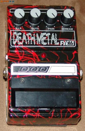
doddeathmetalfx86_3733_large.jpg

Not the dorkiest (those old Peaveys and the Line 6 stuff take the cake there), but definitely one of the most laughable.

It's all about the labeling of the knobs here.

I saw one of these in a guitar store back in the day and I literally LOL'd; hard.

It's impossible to take this pedal seriously.
 
I seem to remember the guys on an Andertons video not being able to read the name of this pedal. I think that people should be able to read the name of a product, but maybe I’m old-fashioned.

I agree with this one. Weird graphics design and the name font. I mean like the top part is a reference to the sixties, but the name is in a weird font. Almost like a black metal font for the name.
 
That fender Drive has the old classic coke machine feel to it. Send it to Rick Dale and he will make it as new for $40,000
 
Wow -these are so strange -who greenlit these? :)

It does have a racing feel -but I feel like these will be huge with anyone who wears a bowling shirt.

They seem like the laziest designs ever. Like if there were stock design templates to show you how the program works, it would be these.
 
Back
Top